Actually… you’re f right. Why do I create problems for myself, just add everything to one pot and let users fav/star the ones they want and use the “Favourites” folders. Thanks
Footnote2669
- 11 Posts
- 183 Comments
The issue I have is that all users see the same music (all of it). I would like to be able to “disable/enable” songs/albums per user
It doesn’t afaik :/
Pure theme ftw
The thing is, it only breaks sometimes (usually when I need it the most lol). Both are installed and I don’t think it would only not work sometimes if they were missing. I’m thinking of hopping to another distro haha I know it’s not arch’s fault, but this excuse is as good as any lmao
The browser is on flatpak but I tried the same thing on steam which isn’t and it still doesn’t work

 13·5 months ago
Just fix the damn UX and UI, that’s all I need

 1·5 months ago
You can type it with one hand. Also, you have other buttons on the top bar, like extensions, settings, arrows, home etc

 3·5 months ago
Fun fact, even if you delete the comment I can still read it in the notification lmao. And they only KINDA did

 3·5 months ago
But why do you need another one?

 5·5 months ago
Human review is NEVER going to happen. The amount of comments from Reddit and user queries is mind boggling

 1·5 months ago
It does, but… it’s sounds cool to do everything with the keyboard and all, but in everyday use sometimes you have the mouse in your hand, or only one hand available. I don’t want to be thinking „oh yeah I need to do that instead”, it’s not comfortable anymore, even if it’s not as efficient

 1·5 months ago
Floorp also exists :)

 5·5 months ago
Im a simple man, less browser UI = good. I only want to see what I need to see. I’d hide the address bar if it wasn’t cumbersome to use with hover (as in hover at the top of the browser window to show the address bar).
It’s more efficient to stack wide elements on top of each other than next to each other.
Especially with websites that are optimised for mobile which means they use only the middle 60% of the whole 16:9 screen, not to mention ultrawide. So vertical space is needed more than horizontal space.
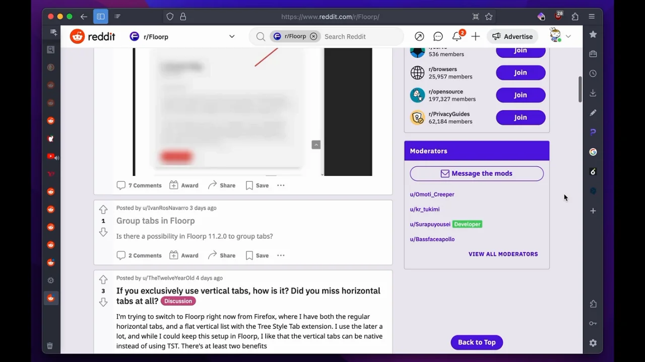
In addition, you can have the vertical tabs hide the text, so you can only see the favicon, unless hovered over. I basically have a 50px bar on the left and top. So this (without the right sidebar, I’m not at my PC so I stole the photo from Reddit :P) :


 6·5 months ago
No, it’s a picture of your mum, cos she’s so fat. I’m sorry

 4·5 months ago
„Eat shit” gets a new meaning

 5·6 months ago
I read the How Linux Works one, it seemed pretty basic, maybe a bit too basic. Plus if you don’t practice the theory in them you’ll forget whatever you read. At least I did lol. All in all, pretty meh
I tried the command line one as well, but couldn’t get through it. Let’s be honest, do you really want to read 300 pages of commands? lol
If you want to learn anything about those topic in these books, practice. You can read all you want but it’s a waste of time if you don’t use it
I’m talking to my past self a bit lmao

 18·6 months ago
Sometimes can’t distinguish between a hydrant and a couch so it wouldn’t do a CAPTCHA either
I think it’s easier to fix issues on Linux than Windows at least. It’s not as obscured by Settings, Control Panel, Advanced Settings, Properties, and Registry in the worst case


Thought this was the onion